Lomo Fonts
1997–1999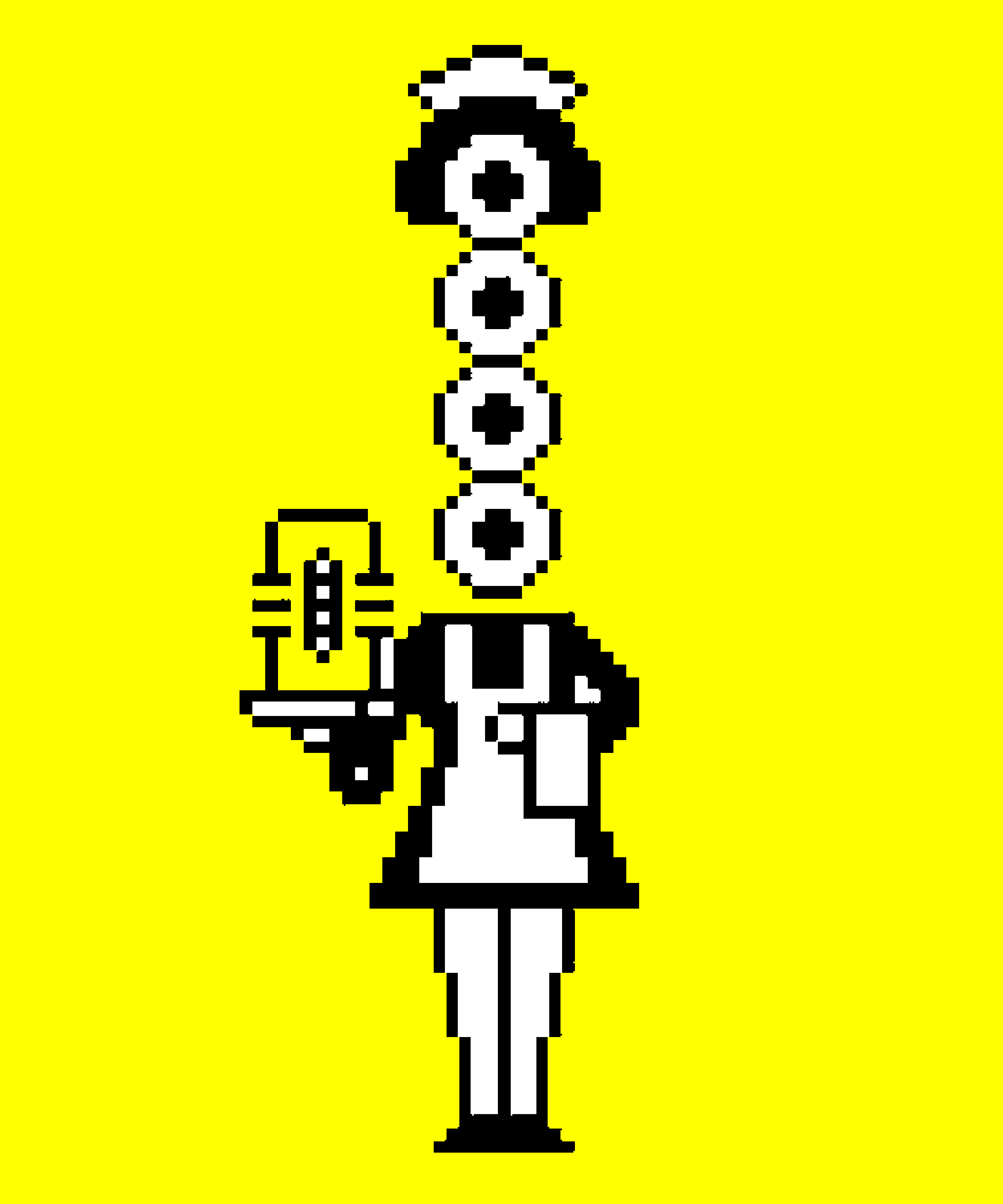
Fidel Peugeot developed the Lomo Fonts on behalf of Lomography founder Mathias Fiegl from 1997 to 1999. The Lomo font dynasty consists of five font families: LomoWall, LomoWeb, LomoCopy, LomoSamples and LomoActionSampler. In 2002, four font families were released by Linotype/Monotype.
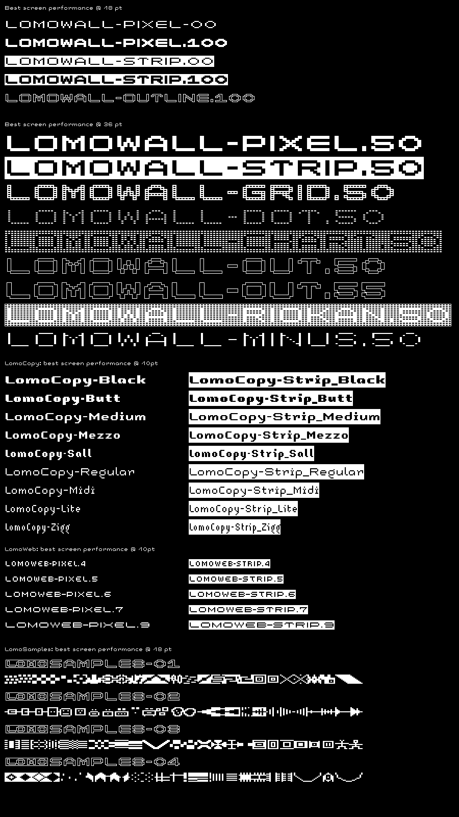


Inspired by the photo walls of Lomo Art Director Bernhard Winkler, LomoWall was created in 1997–1998. The starting point for this font family is the standard photo formats 10x7 or 15x10 used to design the Lomo walls; this resulted in the concept and grid for the title font. Despite the rectangular grid point (ratio 3:2), pixel-perfect graphics for the screen can be created with font sizes of 18 points and above. The various font styles can be individually combined to create an infinite number of design possibilities and designs. LomoWall is a font construction kit and was released by Linotype/Monotype in 2002.


From 1997 to 1999, the Lomographic Society developed a new website with Australian web designer Julian Wong. Wong wanted a custom font for this design because there was no suitable font available on the global market for the internet at that time. As a result, the second Lomo font family was created almost simultaneously from 1997 to 1998: LomoWeb, a capital mini web font based on 5-pixel letter height and a square pixel point for the smallest possible use on screen. The font initially contained eight font styles to ensure typographic flexibility. In 2002, Linotype/Monotype released 12 styles of LomoWeb.

For further web and print applications, LomoCopy was created in 1998, a font family for larger amounts of text with a total of 18 styles. Important factors in the development of this font were the legibility of the text on screen and in print. Its character should be committed to reading flow and not technical gimmicks. Details: The small ‘g’ with an antique-style descender emphasises the reading direction! A capital “T” that, with its rounded edges, is more reminiscent of a mushroom than a “T”, but is ultimately more legible and also works well when used in uppercase. LomoCopy was released by Linotype/Monotype in 2002 in a font family with 14 styles, ranging from narrow and slim to wide and bold.

The fourth font family, LomoSamples, was created in 1998. These are small digital illustrations (dingbats) that can be combined to form new patterns. LomoSamples are based on the rectangular pixel and the modular principle of LomoWall. The font was released by Linotype/Monotype in 2002 with four font styles.

LomoActionSampler, the last and previously unpublished Lomo font, was created in 1999. Based on the idea of the LomoWall, it is built on a square and round pixel point. LomoActionSampler is ideal for font animation. The first applications of these animations were shown in 2000 in a joint ping-pong exhibition with Bernhard Winkler at the Eyefish Gallery in Kyoto, Japan.
Click here to view the individual Lomo Font families: LomoWall • LomoWeb • LomoCopy • LomoSamples • Lomo(AS)ActionSampler