Lomo Copy
1998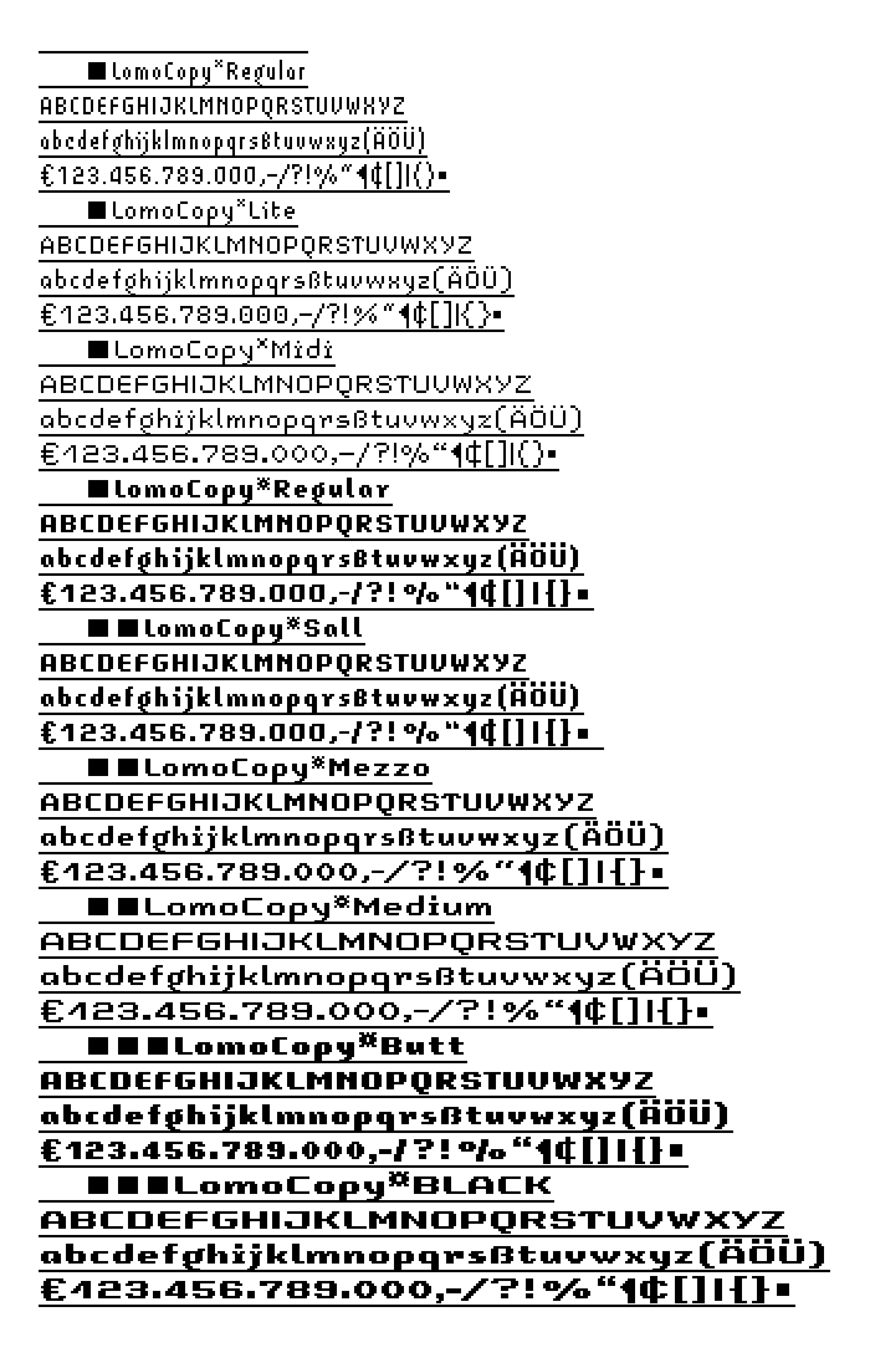
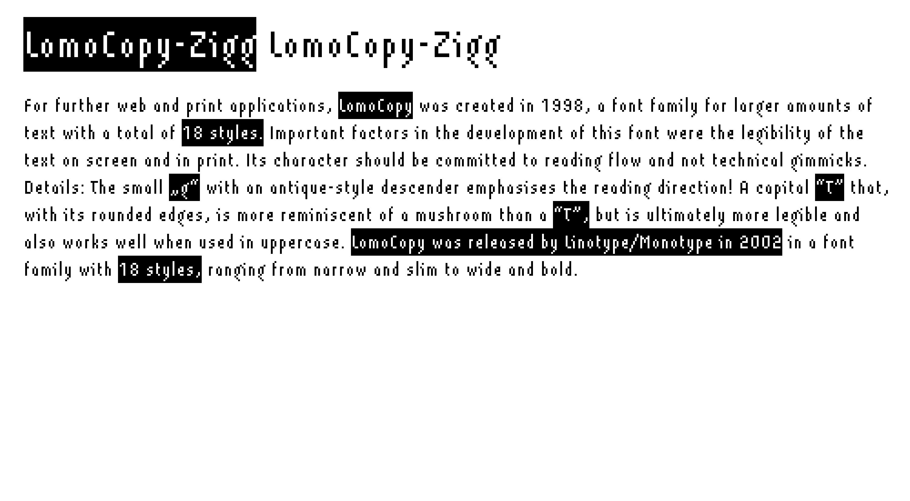
For further web and print applications, LomoCopy was created in 1998, a font family for larger amounts of text with a total of 18 styles.
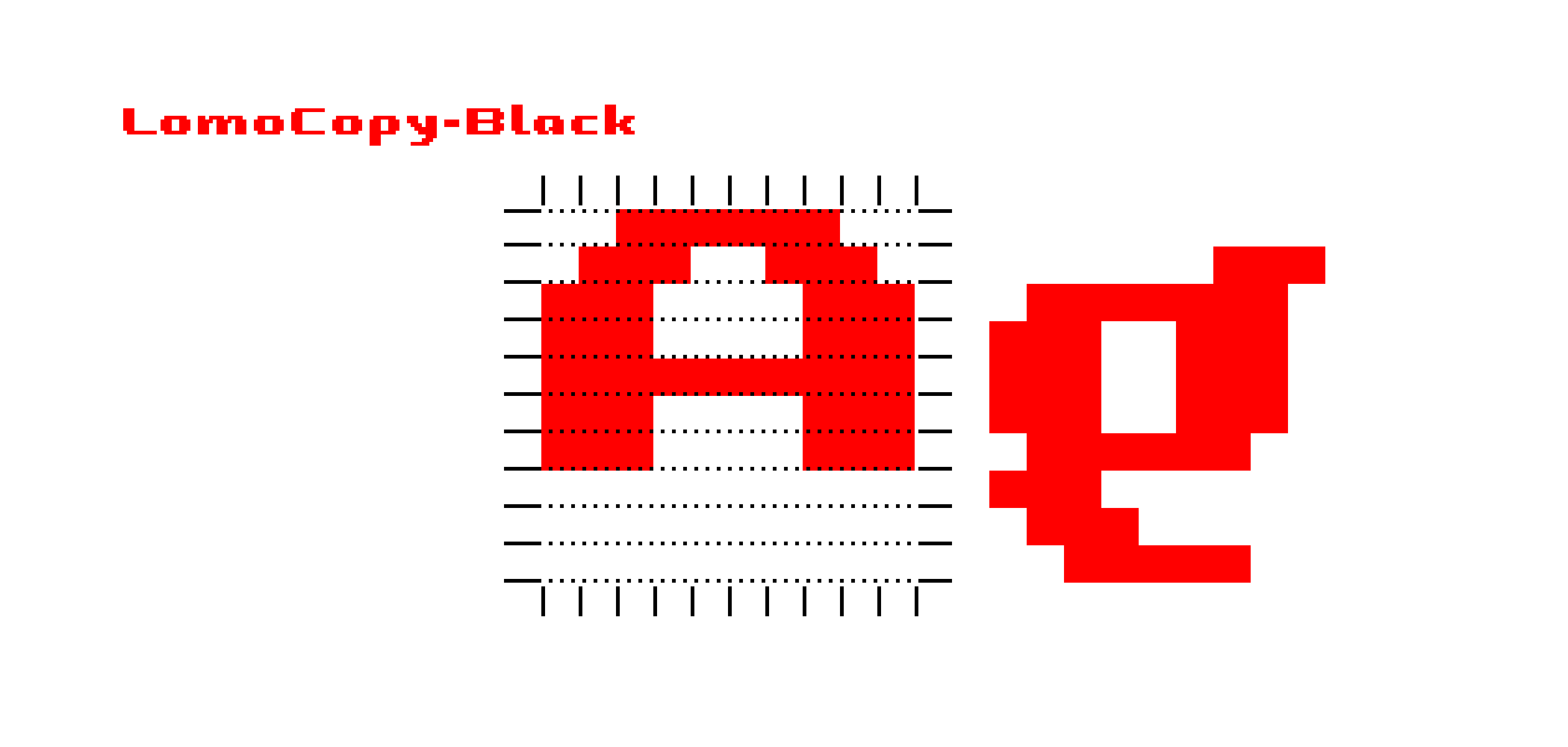
Important factors in the development of this font were the legibility of the text on screen and in print. Its character should be committed to reading flow and not technical gimmicks. Details: The small ‘g’ with an antique-style descender emphasises the reading direction! A capital “T” that, with its rounded edges, is more reminiscent of a mushroom than a “T”, but is ultimately more legible and also works well when used in uppercase.
LomoCopy was released by Linotype/Monotype in 2002 in a font family with 18 styles, ranging from narrow and slim to wide and bold.
LomoCopy with
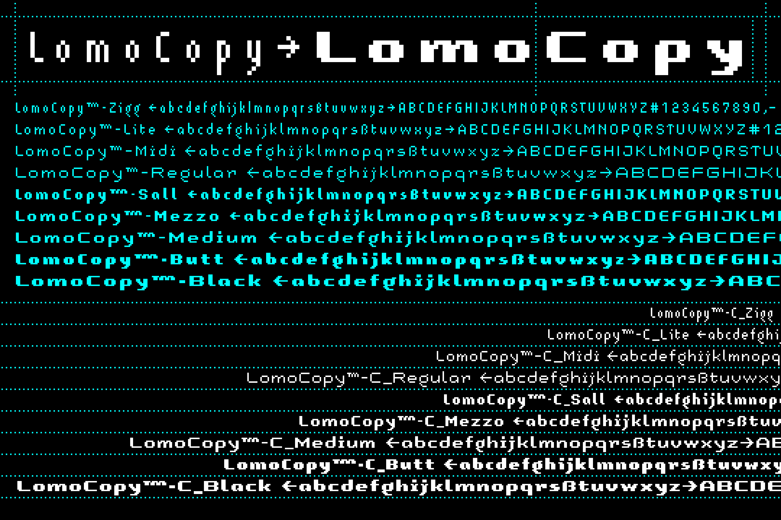
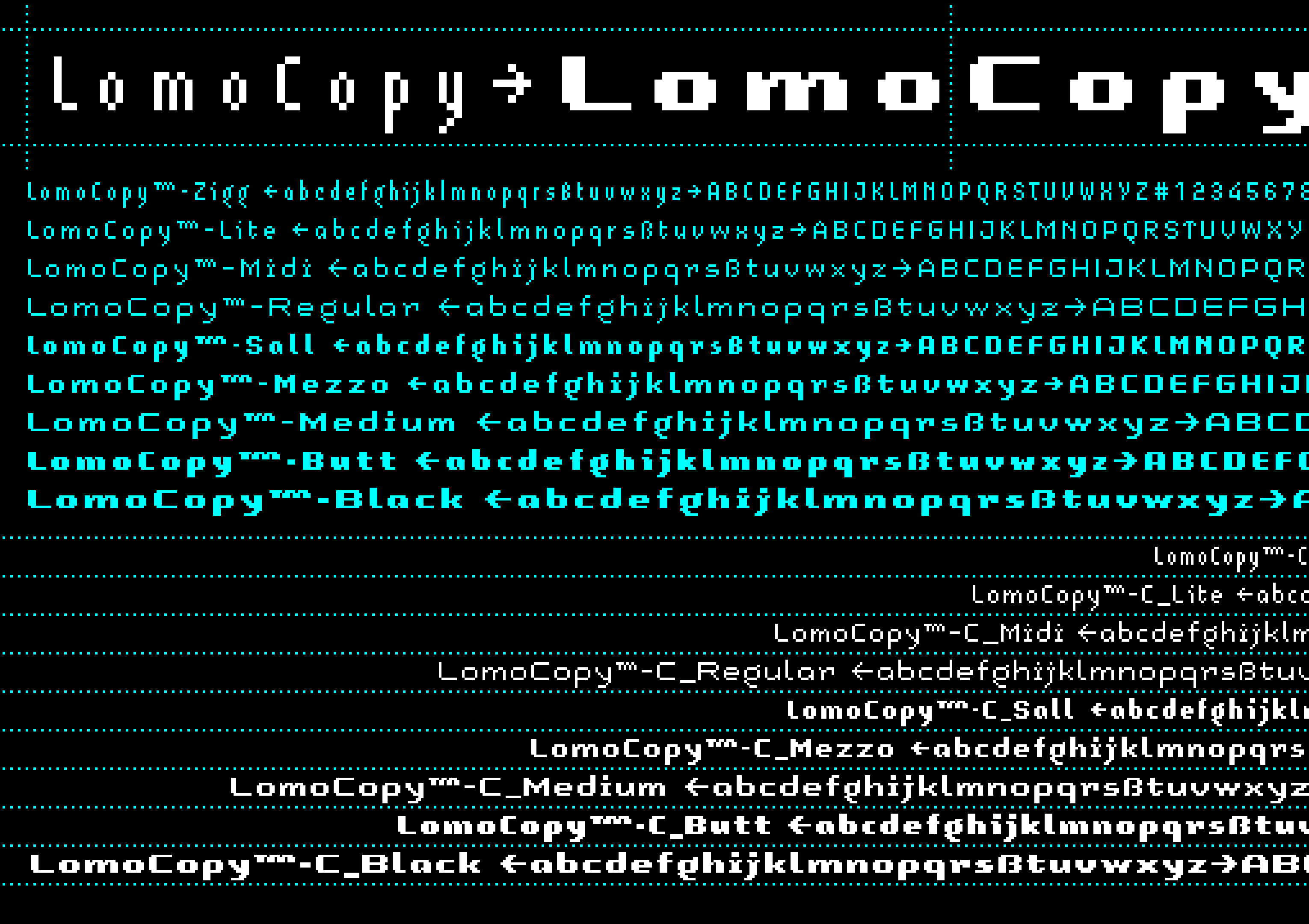
18 font styles


Click here to view the individual Lomo Font families: LomoWall • LomoWeb • LomoSamples • Lomo (AS)ActionSampler